Font Choice
Though research has shown that most fonts designed specifically for dyslexia do not lead to increased reading speed and accuracy, readers may want to choose a font they prefer and is most comfortable for them.
Try out different font style options in Clusive!
Readers may prefer different fonts in order to reduce barriers for fluency in decoding, to match a reading purpose, mood, or to help engage with a text. Options for text size, line spacing, letter spacing, and font allow readers to find a combination that works for them.
Readers may prefer different fonts in order to reduce barriers for fluency in decoding, to match a reading purpose, mood, or to help engage with a text. Options for text size, line spacing, letter spacing, and font allow readers to find a combination that works for them.
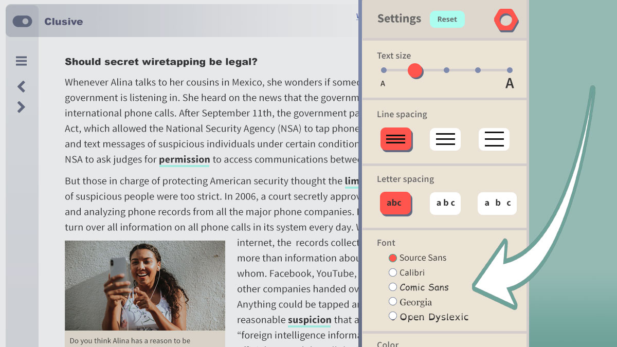
Clusive article with tool settings sidebar open on the right side of the page. An arrow points to a section labeled, "Font." Radio buttons are next to each of the following choices "Source Sans," "Calibri," "Comic Sans," "Georgia," and "Open Dyslexic."
Research
There have been a few different fonts designed for children and adults with dyslexia: Dyslexie, OpenDyslexic, and EasyReading.
- One study of Dyslexie, with 170 Dutch children with dyslexia aged 7 to 12, found no improvement in reading speed or accuracy when Dyslexie was compared to Arial and Times New Roman.
- However, another study with 39 Australian children in grades 2 to 6, found children read 7% more words per minute in Dyslexie compared to Arial. But further analyses showed the improvement was due to Dyslexie’s letter spacing and not to its specially designed letter shapes.
- A study of OpenDyslexic, with 13 third to sixth graders in the US, found no improvement in reading speed or accuracy.
- A study of EasyReadingTM, with 533 fourth graders (54 with dyslexia and 27 with some reading difficulties) in Italy, found EasyReadingTM led to faster reading with fewer mistakes compared to Times New Roman. But the researchers noted it was not clear if the results were due to the font or its spacing between letters, words, and lines.
There has also been some research conducted using commonly-available fonts, such as Courier, Times, Arial, and Comic Sans, with some conflicting results.
- The British Dyslexia Association has recommended the use of sans serif fonts such as Arial or Comic Sans and other researchers have based guidelines on this recommendation.
- One study found, among 27 children in 4th – 6th grade, Comic Sans, Arial, and Times New Roman produced better reading efficiency than Courier. The authors also found that children significantly preferred Comic Sans over the other fonts.
- However, a different study investigated 12 fonts with 48 people with dyslexia (aged 11-50), and recommended Courier, Arial, Helvetica, Verdana, and CMU. Additionally, they found no difference in reading that could be attributed to a font’s use of a serif.
Related Guidelines
The features of the CISL tools are related to existing guidelines and best practices, including the Web Content Accessibility Guidelines (WCAG) and the Universal Design for Learning (UDL) Guidelines. The feature of font choice is connected to:
Web Content Accessibility Guidelines (WCAG)
WCAG does not require font choice be provided, but Guideline 3.1 Readable requires that developers make text content readable and understandable. Text choice, particularly fonts that support readers with dyslexia, can allow students to decode and meaningfully engage with text.
Universal Design for Learning (UDL) Guidelines
- UDL Checkpoint 1.1: Offer ways of customizing the display of information
- UDL Checkpoint 2.3: Support decoding of text, mathematical notation, and symbols
- UDL Checkpoint 7.1: Optimize individual choice and autonomy
Font choice in other work
Want to see what other projects are doing with font choice features? Also check out The Reading Well’s overview of fonts that can support readers with dyslexia.