Color and Contrast
Clusive allows readers to pick a setting for screen colors and contrast that best meets their preferences. People may need the ability to change the color contrast due to a visual impairment or other disability, or they may find that a certain setting is simply more comfortable or enjoyable. Clusive supports readers in finding out what contrast setting works best for them in different contexts.
See what color and contrast options you prefer in Clusive.
Black text on a white background and white text on a black background are two high-contrast options for screen settings.

Black text on a white background and white text on a black background are two high-contrast options for screen settings.
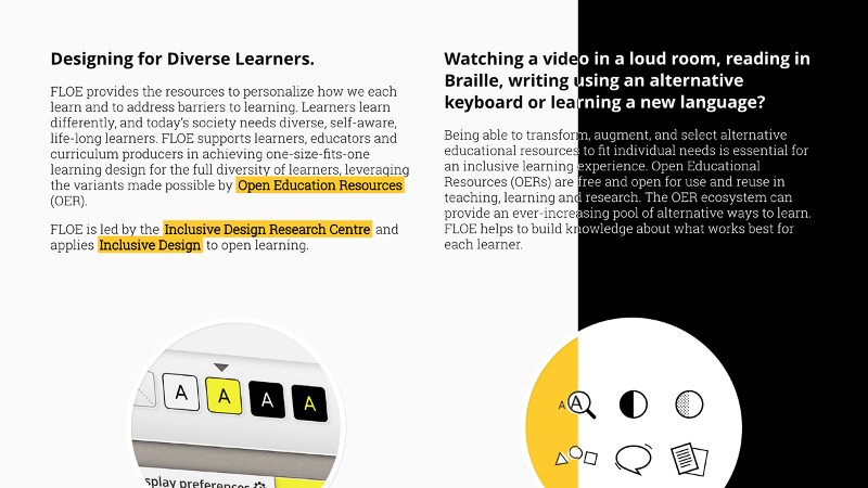
Two paragraphs of text side-by-side. The first paragraph is written in white text on a black background, with three terms bolded and highlighted in yellow. The second paragraph is split: the right side has black text on a white background, but the left side switches to white text against a black background. Below the two paragraphs are two images: one of a series of buttons showing the letter “A” in different text colors against different background colors, and the other of a series of icons including a magnifying glass and a speech bubble.
Research
Several studies have found that contrast ratio has a significant impact on peoples’ experiences viewing text and images.
- A study of 468 university students (ages 18 to 21 years old) with normal or corrected to normal vision found that background and text color combinations significantly affect people’s ability to identify characters. A darker text on a lighter background results in greater accuracy than lighter text on a darker background.
- Greater accuracy in identifying text characters, the effect noted above, may be driven by contrast rather than color. A series of three experiments on 20 college students with typical vision found that text-to-background contrast ratio significantly impacts visual performance, and has a greater impact than color.
- This pattern may apply to people with visual impairments. Among 58 visually impaired college students in one study, dark text on a light background was reported as more legible than other color combinations.
- This may also be true for individuals with dyslexia. In a study of 22 individuals with Dyslexia, ranging from 13 to 37 years old, most participants said they favored a high-contrast color pairing for online reading.
- Contrast preferences may apply to images too. One study tested a color contrast enhancement algorithm on 12 people with typical vision who wore glasses that simulate low vision. Participants preferred images that had been enhanced by a color contrast algorithm over un-enhanced versions
- Furthermore, in addition to increasing the readability of digital texts, an empirical review of multiple studies on color and contrast concluded that providing multiple text and screen color options can lead to reduced cognitive load, increased retention, and improve the usability of digital reading tools for students with disabilities.
Related Guidelines
The features of the CISL tools are related to existing guidelines and best practices, including the Web Content Accessibility Guidelines (WCAG) and the Universal Design for Learning (UDL) Guidelines. The feature of adjustable contrast settings is connected to:
Web Content Accessibility Guidelines (WCAG)
- WCAG requires a contrast ratio of at least 4.5:1 for standard size text to meet level AA (WCAG Success Criterion 1.4.3), and 7:1 to meet level AAA (WCAG Success Criterion 1.4.6).
- User interface components like buttons are required to have a contrast of 3:1 (WCAG Success Criterion 1.4.11, level AA)
Universal Design for Learning (UDL) Guidelines
- UDL Checkpoint 1.1: Offer ways of customizing the display of information
Adjustable contrast examples
Microsoft Immersive Reader allows users to choose a color theme, impacting the contrast levels, for any document within a variety of Microsoft applications.
Check out DeveloperSpace for a compilation of examples and more supporting literature.